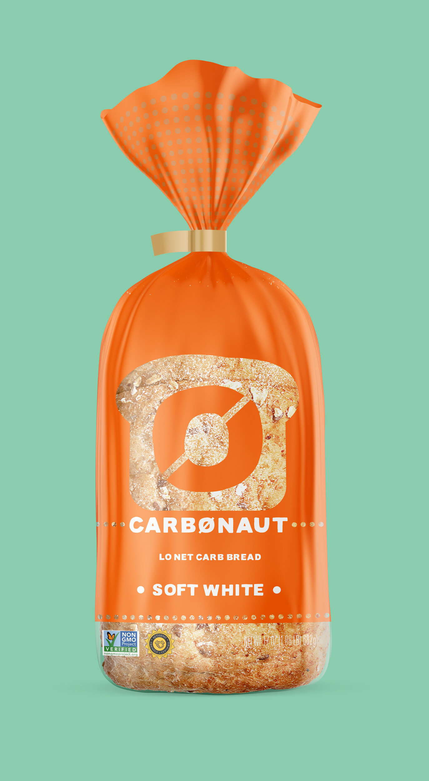
Carbonaut
The brand idea of Carbonaut was hatched in collaboration within the studio/client team to convey the excitement for this fresh, new, low-carb, keto friendly bakery product. Several designs were presented to explore the whimsy of this name in a contemporary understated manner that would appeal to this consumer. The chosen design direction uses subtle cues to allude to the cutting or omission of carbs with the use of diagonal slash marks, and window reveals in the shape of product in the package design. The playfulness and double entendre of the name itself lends to some spirited “anti-gravity” photography that can be used in web and advertising application, showing the carb-lightness of the product.
Studio: Bright Design, Los Angeles
Copywriting: Julie Curtis
Creative Direction/Design: Christy Van Deman
Creative Direction/Brand Design: Christy Van Deman; Website/Social Design: Mark Respicio
Design Studies


